It’s 2025 and… we finally have Instagram on the iPad. That’s quite the surprise, because both Instagram and the iPad launched 15 years ago, yet it’s taken so long to get a version of the social network on the tablet. Here’s how to get started with Instagram for iPad, but be warned: It’s a bit different than you might expect.
Getting started with Instagram for iPad
Credit: Pranay Parab
This is the easy part. You just need to open the App Store on your iPad, search for Instagram, and download the app. Alternatively, if you’re reading this on an iPad, you can click this link to directly go to the store page. Once the app is downloaded, sign in to your Instagram account, and you’re ready to roll. The initial setup process is quite similar to Instagram on iPhone. You need to sign in with your credentials, and you see the same permissions popups (notifications, and permission to track you across apps to show personalized ads). Feel free to deny both permissions if you’d like, and then you can start using the app.
How Instagram for iPad differs from the iPhone version
Credit: Pranay Parab
Having used Instagram’s iPad app for a day, I’m honestly quite disappointed with what the company has released. It looks and feels like a pre-release beta, designed with the sole intent of increasing engagement rather than providing an experience that makes sense on the the iPad’s bigger screen. It’ll probably achieve the growth targets that its parent company Meta wants, but I wish the app had the polish of its iPhone counterpart.
Case in point: The iPad app’s “Home” tab is different when you compare it with its counterpart on all other platforms. On iPhone, Android, or the web, tapping the Home icon takes you either to a feed of posts from people you follow or suggested posts from the app’s algorithm. On the iPad, it takes you directly to Instagram Reels. You will see Stories from people you follow up top, but below that, it’s an immediate dive into Reels. I’d expect this behavior when I tap the Reels tab on the iPhone app, but putting it right on the Home tab is a bit much.
Instagram says this is intentional. “With Instagram for iPad, we’ve redesigned the experience to reflect how people use bigger screens today – for lean back entertainment,” the company said in its blog post announcing the app, which hints at an increasing number of people using TVs and other large screens to watch short form videos. It’s clear that the iPad app was designed to instantly suck you into the Reels algorithm and increase the time you spend using Instagram.
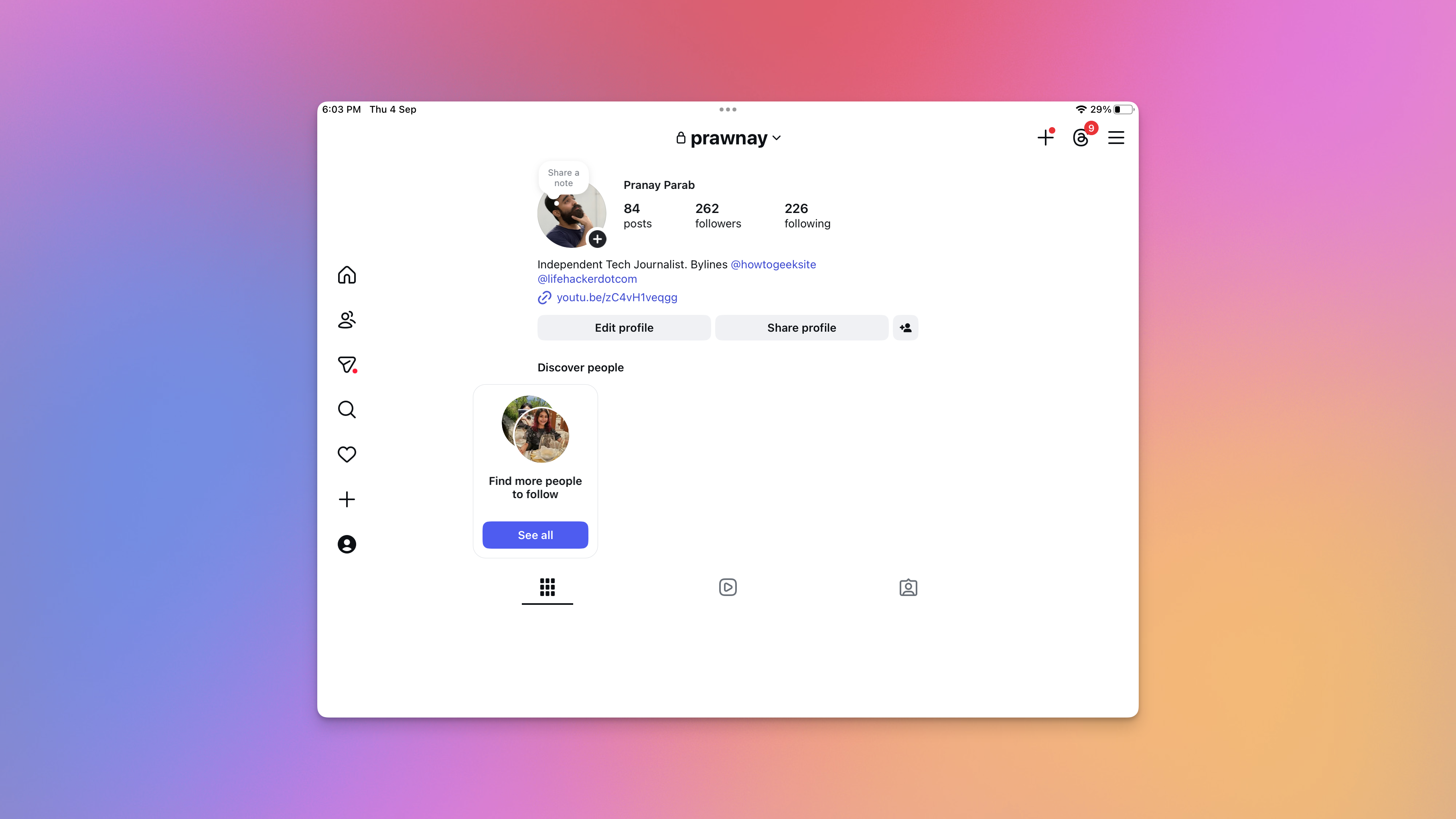
Credit: Pranay Parab
To see your feeds, you need to first tap the “People” icon on the left. This shows your Following feed, which is divided into three tabs: All, Friends, and Latest. All shows a mix of content from people you follow and suggested posts, while Friends focuses on posts that your friends have liked or reposted. The Latest tab is the chronological feed, which is what I personally like to use.
There are still buttons for messages, search, notifications, creating new posts/Stories/Reels, and going to your profile. All of these work the same as they do on the iPhone app, and they’re placed neatly in the left pane, which makes them easy to reach if you’re holding your iPad with both hands. Other than this, there’s very little here to suggest that the app has been designed with much care for the person using it.
One of the most annoying things I keep running into is that the app keeps switching from light mode to dark mode. With my iPad’s system settings in light mode, Instagram opened the Home tab in dark mode, and it also used a dark background when I tried to create new posts. When I tapped any video in the Following tab, it expanded to a full-screen mode, and used a dark background there, too. However, all other tabs opened with a white background. When I enabled dark mode on my iPad, Instagram thankfully respected that choice and darkened all backgrounds, but I wish there was more consistency for light mode.
Credit: Pranay Parab
I also tried using Instagram in Split View on my iPad, which meant that I had Instagram and a second app open at the same time. In Split View, you can change Instagram’s window size. When you reduce Instagram’s window to one-third of the screen, the app switches its layout to look a lot like the iPhone version. Most tabs are moved to the bottom of the screen, and a couple buttons are moved to the top (the create button and messages button). The app worked well in Split View, which is good news for the type of content Instagram is prioritizing now. Since the app focuses so heavily on vertical videos these days, using it in full-screen mode makes little sense on an iPad. You see giant black bars on either side of your videos and there’s a lot of dead space that could’ve been put to better use.
To be fair, when you open a post and try to read the comments, the video moves to the left and the comments appear on the right. Other than this, I couldn’t spot many good uses of the iPad’s larger display. It’s why I mostly prefer using Instagram in Split View on my iPad, where I can use a browser alongside it. That way, if I see something interesting on Instagram, I can quickly look it up in a browser and find out more.
Maybe you’ll get more use out of Instagram for iPad, but either way, be prepared for a bit of a learning curve.