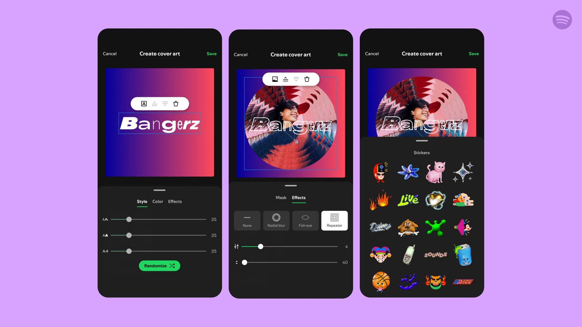
You’ve now got more options when it comes to giving your Spotify playlist artwork a personalized touch: A new custom cover art tool is rolling out inside the mobile apps for Android and iOS, which lets you put together bespoke art designs made from pictures, text, and stickers.
Officially in beta for now, the feature is live for free and premium users across multiple countries (try closing and restarting the app if it doesn’t show up). “We’re giving music fans the power to design and customize their own playlist cover art so their playlists can always look as good as they sound,” says Spotify.
Credit: Lifehacker
Spotify has put some real effort into it, too: The streaming service got artists including Clairo, Jamie xx, and Arlo Parks to create custom playlists and matching artwork, while professional designers have also been enlisted to produce some of the image and sticker options you’ll see in the app.
Custom cover art works alongside the existing option, which lets you drop in an image of your own to illustrate a playlist. If you’d prefer to create something unique inside the Spotify app itself, that’s now possible.
How to create custom cover art on Spotify
This process works the same whether you’re on Android or iOS: Find the playlist you want to edit the cover art for, open it up inside the app, then tap the three dots just above the track listing. From the menu, choose Create cover art.
Then you’ve got two options: Create cover art, which is the new feature, and Change cover image, which was already an option. Opt for the latter, and you can pick a photo from your phone’s gallery or take a new photo to illustrate the playlist with. The app will crop your picture so it fits.
Credit: Lifehacker
Here, though, we want to pick Create cover art, which launches the art editor. You’ll see a basic placeholder first of all, and four tabs along the bottom of the screen to help build your creative masterpiece.
Text lets you put text on top of the picture. By default the playlist name will show, but you can add any text you like, in multiple blocks. Each block can have its own font size and style, and there are some effects to play around with too (like spherical text, for example).
Image enables you to drop in a picture from your phone’s gallery—or you can take a new photo with the camera. This image can be cropped to a particular shape, resized, rotated, and repositioned, and again there are effects to play around with (such as a fish-eye effect).
Background is where you can change what’s under the text and images you’ve loaded up on top—by default, a simple colored gradient will be used, but you’re able to tweak this as needed or switch to a solid color. If you’re stuck for inspiration, use the shuffle button.
Stickers works exactly as you might expect, offering up a selection of little icons and graphics to decorate what you’ve made. There aren’t a huge number of stickers available, though presumably we may see Spotify add to this selection as time goes on (this is a beta, after all).
When you’re happy with how everything is looking, tap Save and Save again to apply the artwork. As far as I can tell, at the moment you can’t revert back to the original playlist cover (populated by the album art from your choice of tracks), though you can of course create something new to overwrite it.
Bear in mind that you can’t save drafts of cover art while you’re working—you need to either apply the design or start again from scratch—and you can’t store multiple art options for a playlist (so if you want to apply a new cover but save the old one, you’ll need to screenshot it first).
