Last week, YouTube started rolling out a new look across both the web and its various apps, promising a “more expressive and intuitive interface.” In reality, the reaction has been mixed. The TV app, for instance, no longer automatically rewinds or fast forwards when you press back or forward, instead navigating between buttons including “like” or “subscribe.” More than once while on TV, I’ve accidentally subscribed to a channel without meaning to, before realizing that I now need to press up first to get to the progress bar.
Now, the changes have reached the YouTube mobile app, as first spotted by 9to5Google. While they’re a bit more mild than you’ll see on TV, there’s still a few changes to get used to.
Bigger, chunkier icons
Credit: Michelle Ehrhardt
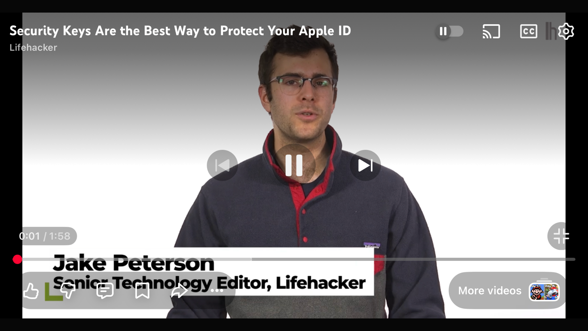
By far, the most noticeable new change is YouTube’s new suite of icons, which all look like they’ve been hit with a “Ctrl + B.” Compared to the old look, the play, fast forward, and other buttons all look larger and bolder, with the idea being to make them more prominent.
Some of the buttons have also been consolidated. When watching a video in landscape, buttons that don’t affect playback (like, dislike, comment, etc.) all now appear together in a pill in the bottom-left corner, rather than as separate elements.
New animations
New buttons aren’t the only change YouTube has in store for you. Seeking videos also has a new animation now, and on some videos, liking now comes with a bit of extra personality.
Credit: Michelle Ehrhardt
The first is a pretty minor change. Now, when you double tap the screen to either go forward or back 10 seconds, the video will just automatically jump to the new spot and display a big “-10” or “+10,” rather than showing a quick animation of three arrows disappearing into each other with a smaller “-10 seconds” or “+10 seconds” below them.
Credit: Michelle Ehrhardt
The second is a bit cuter. On certain videos, tapping the “like” button will now play a custom animation, rather than simply putting some sparkles around a thumbs up. For instance, on a music video, you’ll now briefly see a musical note replacing the thumbs up.
Pausing no longer darkens your background
It used to be that pausing a video would darken the background until you unpaused it, kind of like lights being lowered on a stage. That’s no longer the case. While you’ll still see the lights go slightly down while you have controls open, a paused video will now display as normal if you tap again to dismiss the controls. It’s a small tweak, but could prove useful for taking screenshots. At the same time, though, I do worry that it might make it easy to think a video has frozen, if you’re not paying attention.
Nested comments and easier bookmarks
Finally, Google has removed a few steps to saving and commenting on videos.
Now, hitting the bookmark icon to save a video to a playlist has fewer steps, no longer requiring you to navigate multiple pages. Instead, it’ll just pause the video and open a list of your playlists for you, where you can quickly tap the playlist you want to save your video to.
Credit: Michelle Ehrhardt
Additionally, comments are threaded now, easily showing who is replying to which comment. It’s a great way to keep track of the flow of the conversation, although it does make each comment take up a bit of extra space.
Can you get rid of the new YouTube UI?
Ultimately, I’m a little torn on the new YouTube app. Certain new features, like threaded comments, just make sense to me. But the chunkier buttons do feel like they get in the way a bit to me, and I can’t help but think of Fisher-Price when I see them.
Unfortunately, there’s not a lot you can do if you don’t like the new YouTube mobile interface. It’s still rolling out, so it’s possible you might not see every change yet. But because it’s server-side, once it hits you, that’s it. Even the web player is getting these changes, so leaving the app behind isn’t a viable option.
That said, if you’re on desktop, users on both Reddit and YouTube itself are putting together extension lists that you can mix and match to customize your experience. Technically, there are browsers for mobile that will allow you to play with these as well, with Firefox being the big one these days. However, I found that most of the suggested extensions no longer worked for me or weren’t available for mobile.
In that case, if you’re sick of how YouTube looks now, you might want to consider an alternate player app instead, like Play. It still relies on embedded videos, so it won’t save you from every change, but its overall minimalist style could offer welcome relief from YouTube’s increasingly busy design language.
